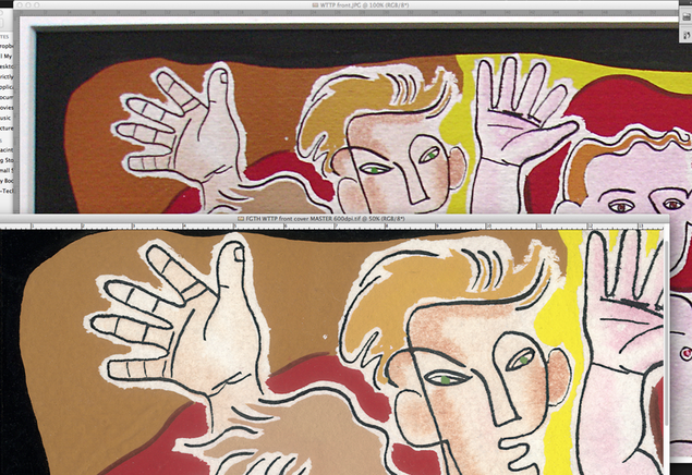
 I’ve been scanning the original Welcome To The Pleasuredome artwork by Lo Cole this week and, comparing it to the existing scans I was working with, there’s quite a bit of difference. It’s tempting with Photoshop to put images through all sorts of filters and processes to make the image ‘pop’, much like compression and limiting on audio files. After a while you can lose sight of the original but having the original paintings to hand I could check on screen that they were as accurate reproductions as possible. Certain colours didn’t initially scan exactly so I made sure that I corrected them to as near as possible with the colours of origin.

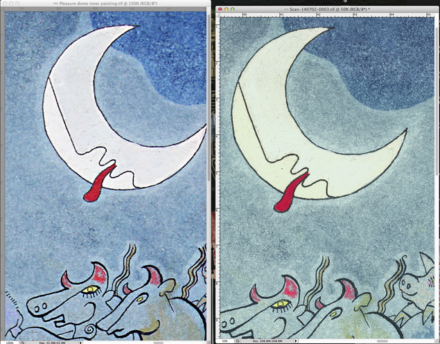
It’s actually hard to tell but the lower left of the moon is a subtlely different shade to the rest. The background is a more yellow/grey tone of blue.
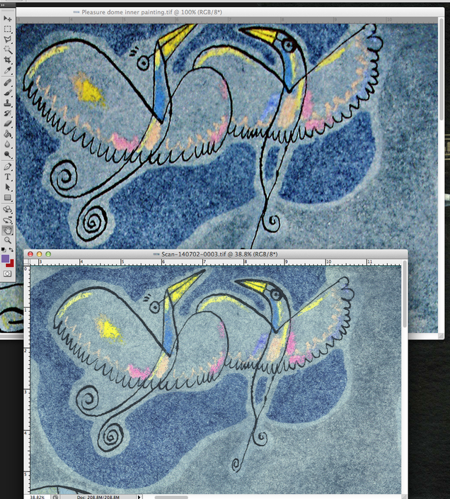
This is a little like remastering from the original master tapes, cleaning up any stray dust or hair particles that have got on to the surface in the process. The blurrier, more saturated images here are the working files I’ve had and the subtler, sharper ones are the new scans that will be seen on the forthcoming box set. If you get the prints from the box, rest assured that the colours on them will be as accurate as possible to the original source (as long as the printer doesn’t mess things up) and if you display them they will nearly pass for originals.

As you can see with this comparison, there’s a bit more of the image on the top and the blues are more grey/yellow.
