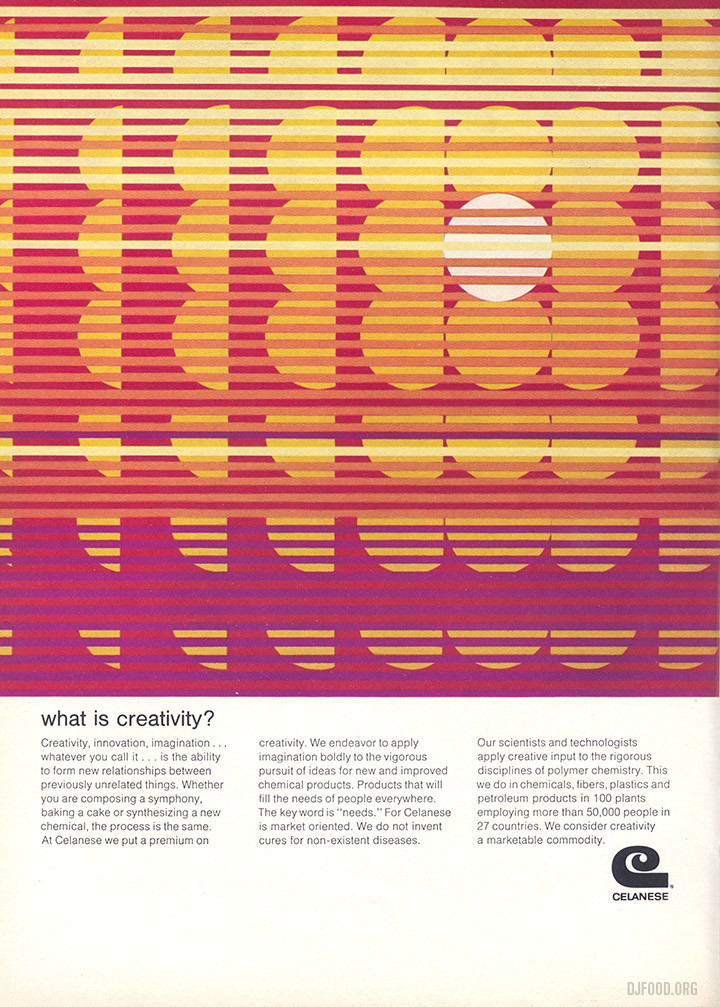
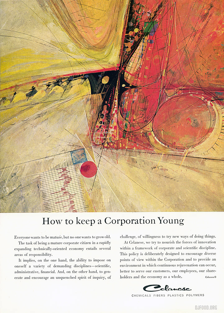
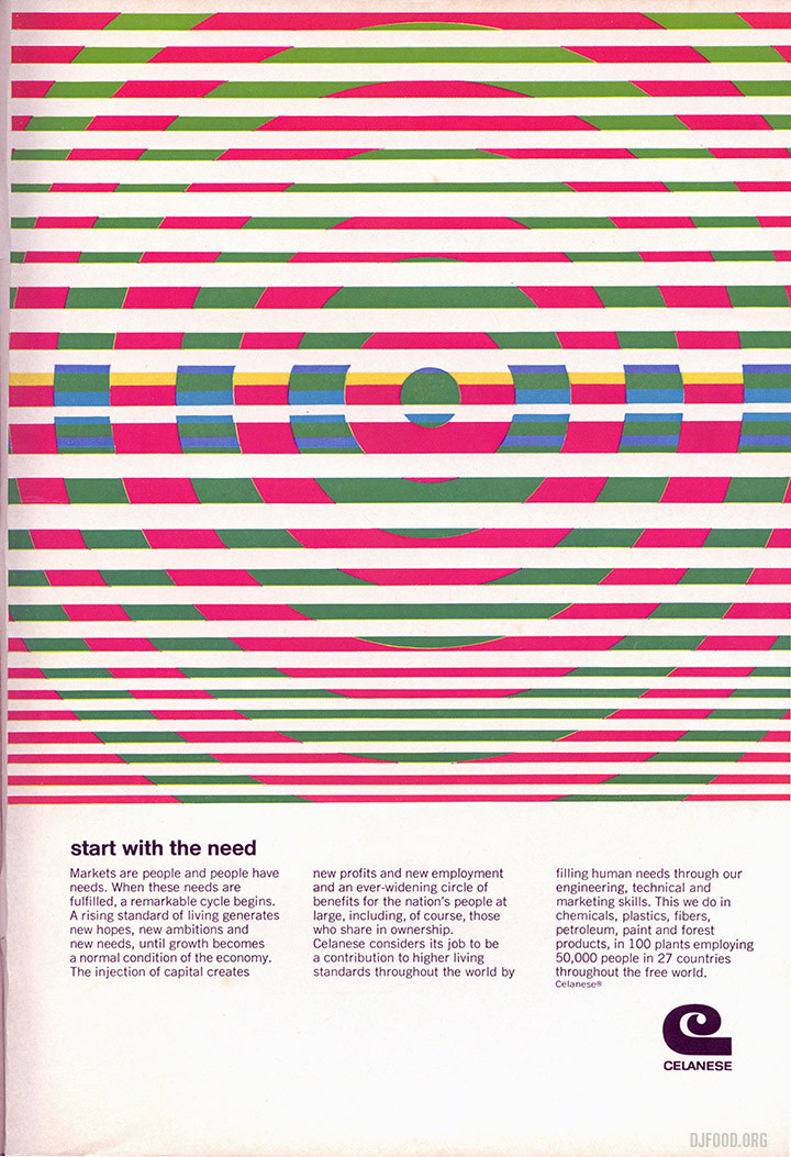
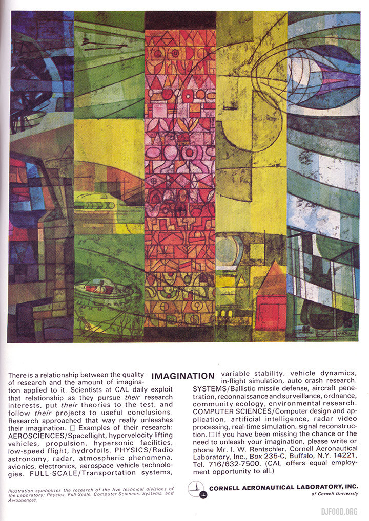
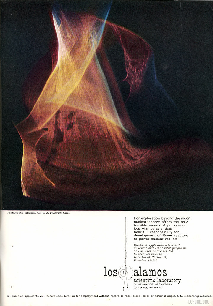
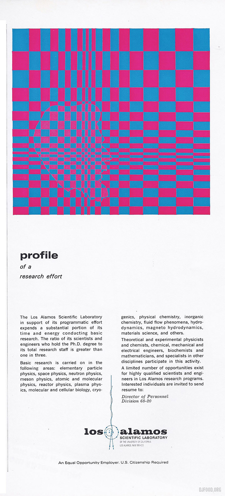
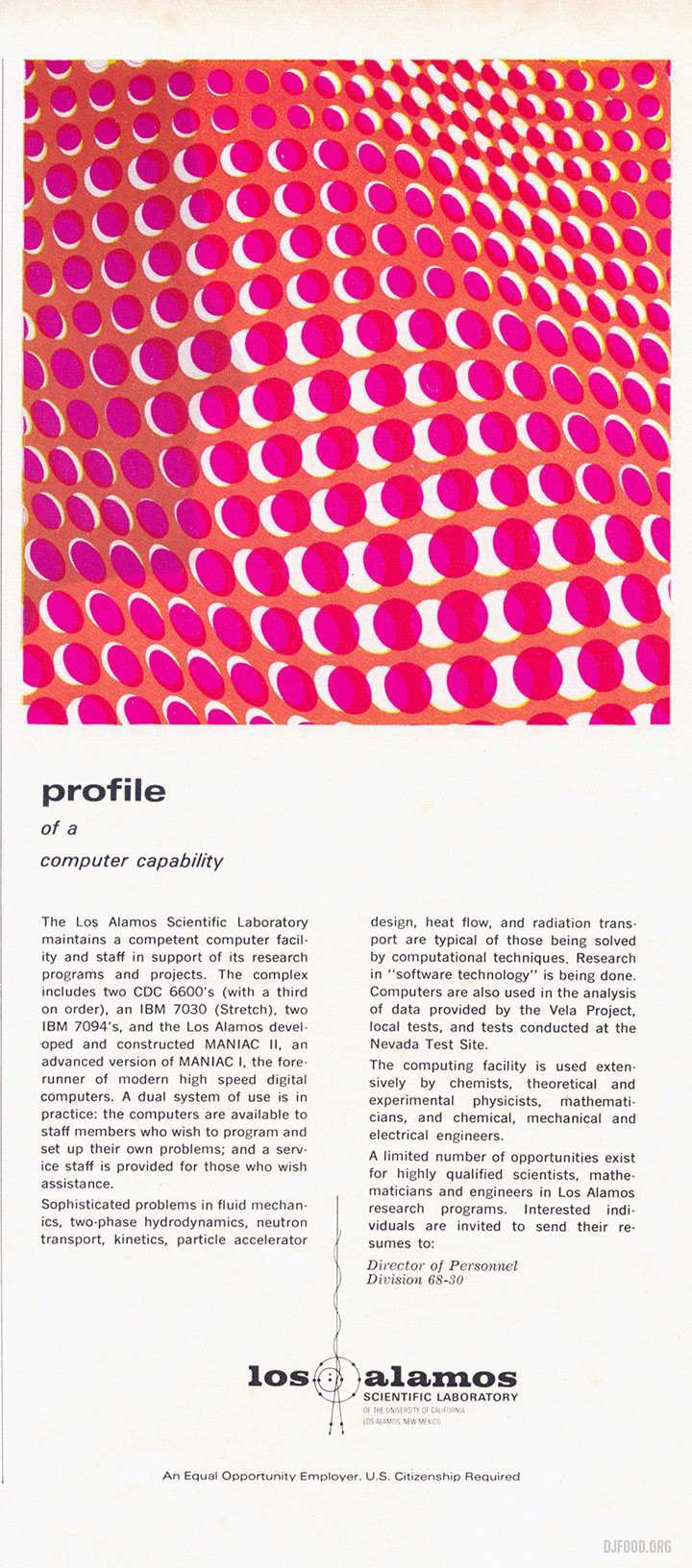
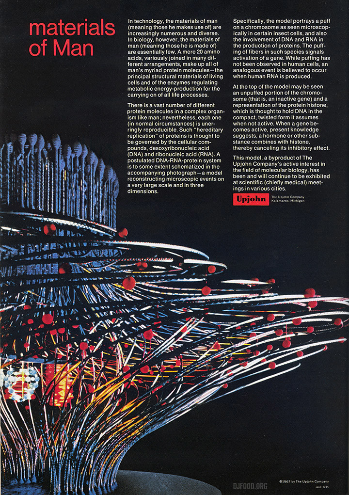
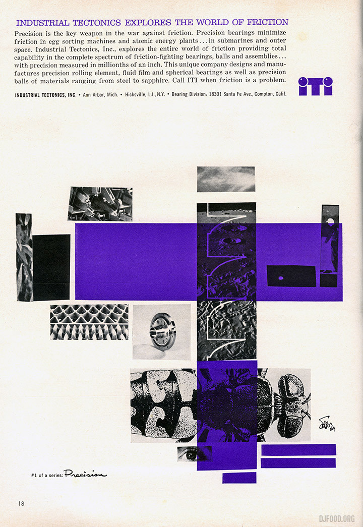
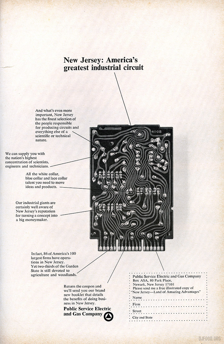
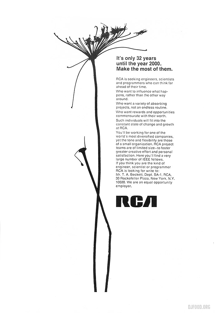
 I was recently sorting out a small book collection for someone and ran across a stash of Scientific American magazines from the 60s. Some of the adverts are just beautiful examples of design, from typewriters to paper, electric and gas suppliers and general engineering companies. The standard is very high, considered and fun, attempting to make the banal interesting. Here are some of my favourite examples.
The three ads below for Fairchild Semiconductor are double pagers – look at that font!
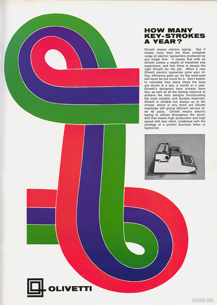
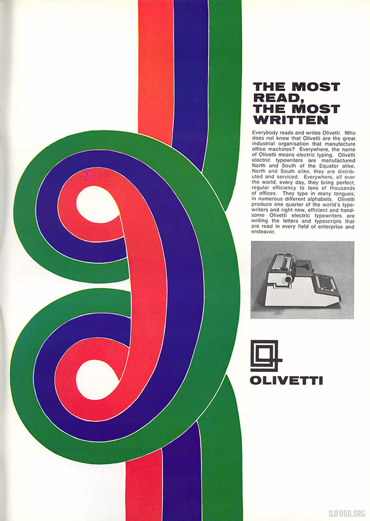
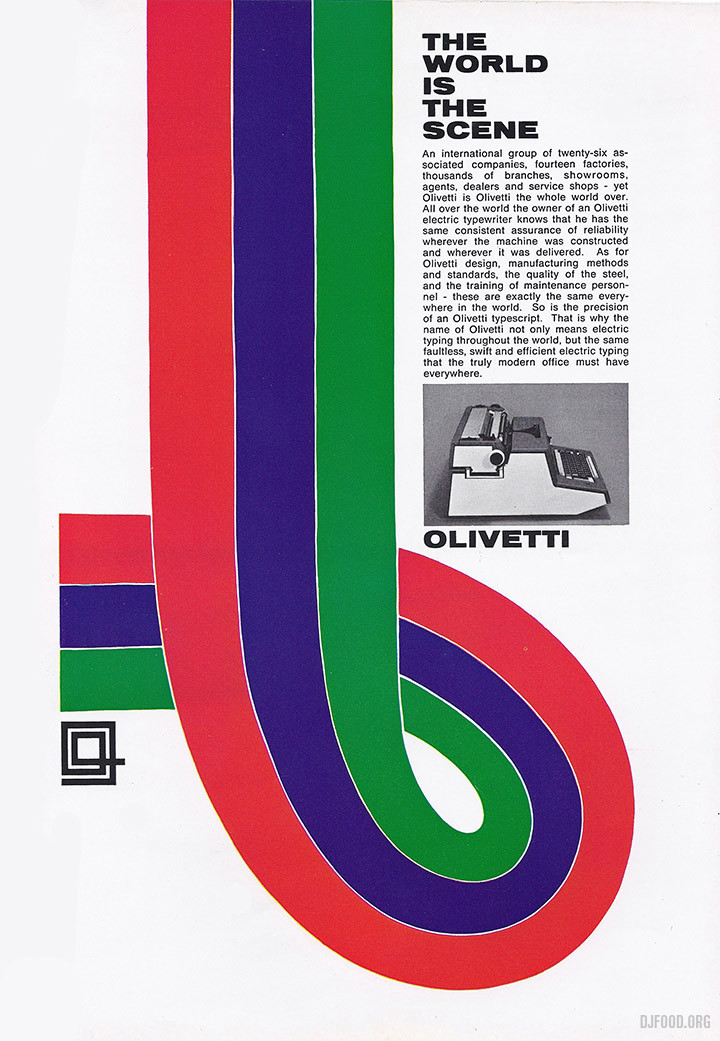
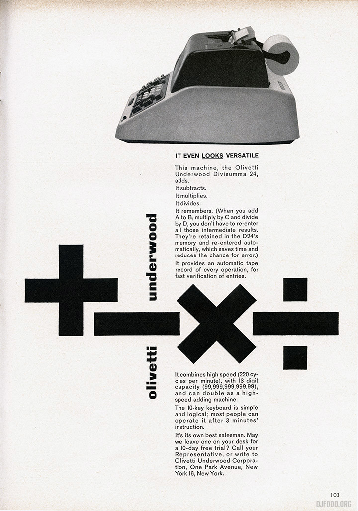
The Olivetti ones below are just stunning, there seems to have been so many of these ads throughout the years, enough to make a huge coffee table book easily. I’ve found them in Graphis annuals and architectural magazines before, there must be hundreds, all seemingly different.
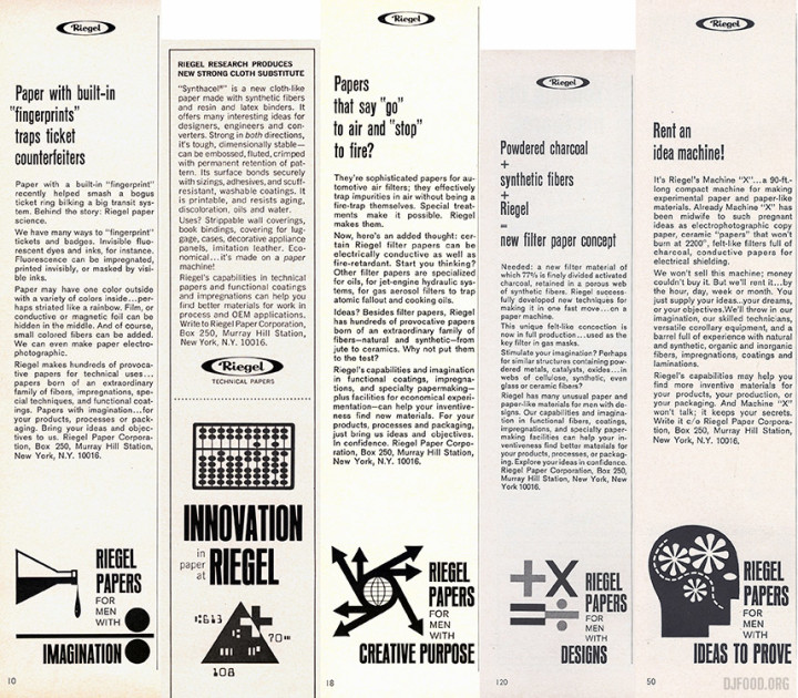
 I love the little illustrations at the bottom of these Riegel papers ads, they are small sidebar ads near the back of the magazine so I’ve lumped them together in one image.
