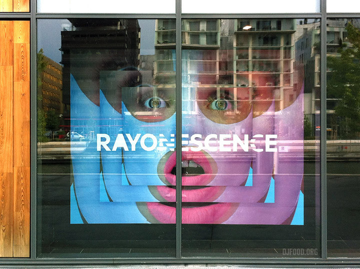
Sephora ad campaign

Sephora1Sephora2

I came across these at the weekend in a window of a shop in Lyon, they were so striking I had to take a photo. A quick google reveals they’re for a campaign for Sephora makeup from a few years back and there are more in the series. A great example of how a simple visual idea can attract the attention & subvert the usual clichés.

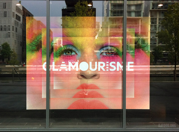
llllitl-sephora-sublimitude-glamourisme-fascinance-attractionisme-rayonescence-bombassitude-publicité-marketing-print-4x3-agence-BETC-paris-luxe-beauté-maquillage-5 image-à-mettre-dans-larticle-1-610x456 image-à-mettre-dans-larticle-3-610x458

Leave a Reply

Your email address will not be published. Required fields are marked *