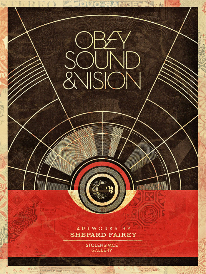
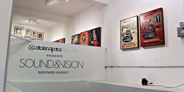
 I finally got to see the Shepard Fairey ‘Sound & Vision’ show at StolenSpace over the weekend and it is highly recommended. There was a vast amount of work pitched between two galleries with a shop in between for good measure and as a body of work it’s very impressive. I’ve been a fan since seeing his early paste ups in New York in the mid 90’s and attended his first London show in ’99 at the Horse Hospital. That he was doing a music-themed show was music to my ears (sorry), given that he’s designed sleeves and videos for a number of acts over the years and knows the language, always inserting musical icons into his work. For those that know Fairey’s style – it’s not a massive departure visually, the red, cream and black colour scheme dominates throughout and that’s fine because it’s a classic. He really doesn’t need to mess with the formula as there’s more than enough here to see and it gives everything a certain coherence.
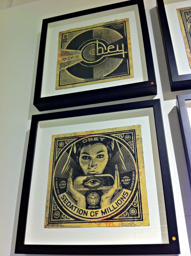
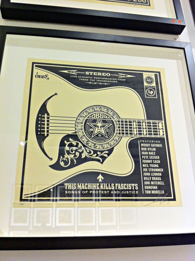
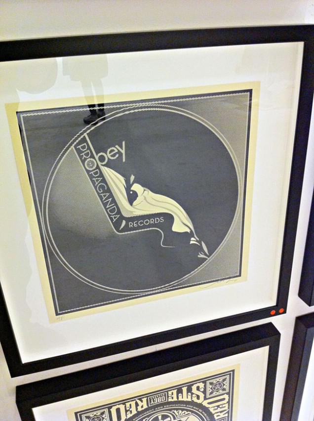
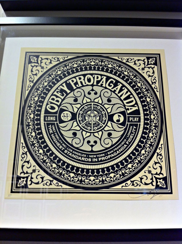
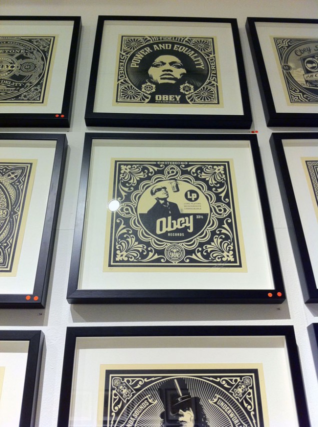
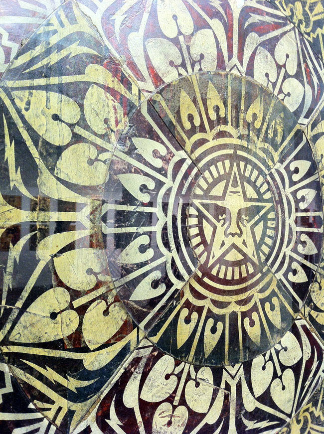
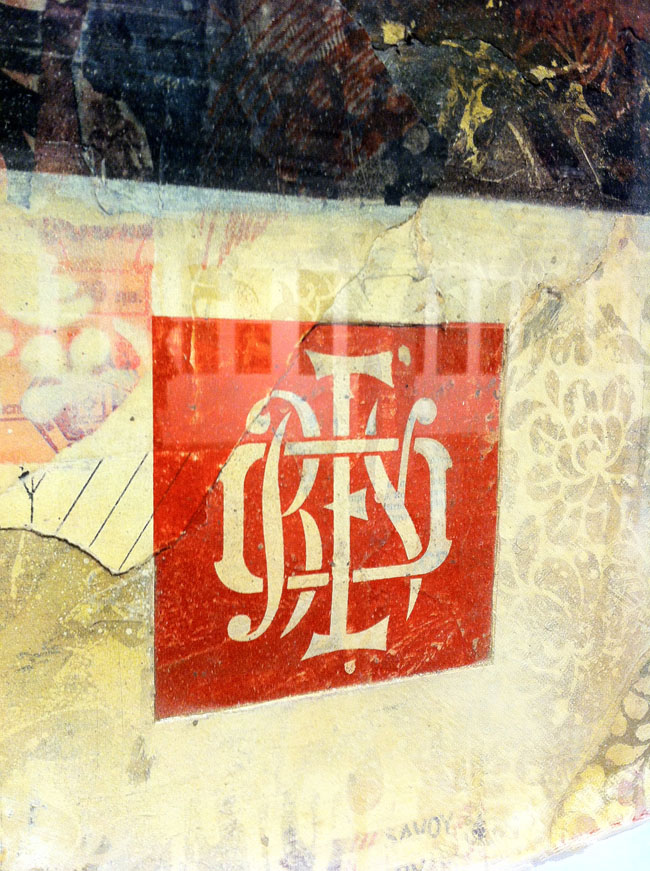
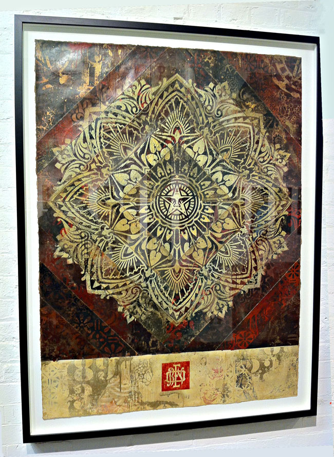
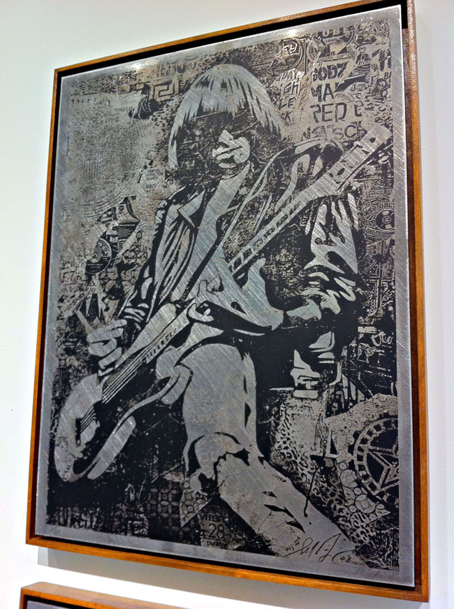
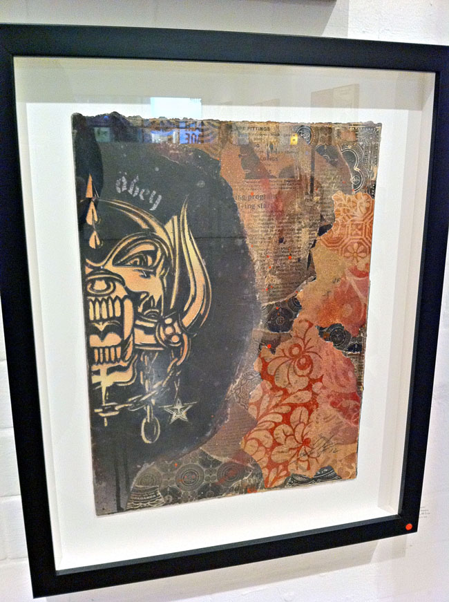
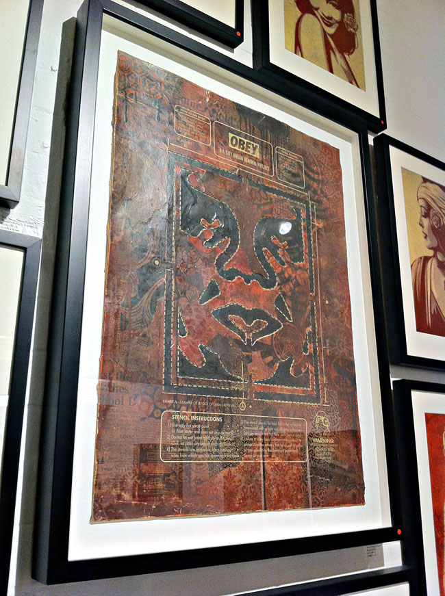
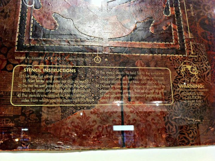
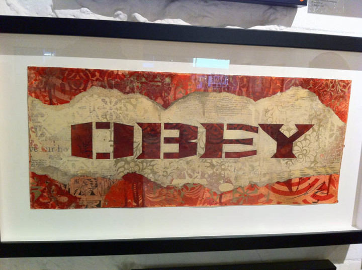
He’s experimented with other ways of presenting though, a series of A2 images are repeated on brushed metal in one part of the gallery and there’s an underlying collage feel to some of the pieces where he’s pasted several layers of paper together before printing over the top, much like the fly-postered surfaces he goes over on the streets. Elsewhere multiple copies of the same print have been dissected, mixed up and reassembled so that geometric patterns are present from the different print and paper colours. These are stunning to see in the flesh, like some ancient scrolls unearthed from an Eastern archive, each one is dirty as if layers of varnish and glue have been applied and their edges remain ragged. Elsewhere he has ‘retired’ stencils pasted into collages, edges thick with paint and given a new lease of life as the tools become exhibits in their own right.
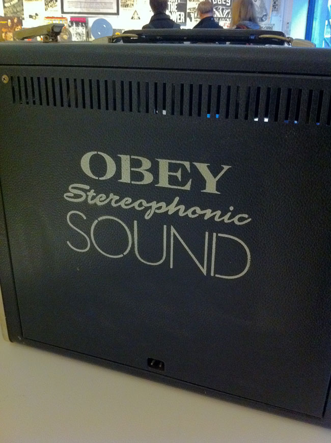
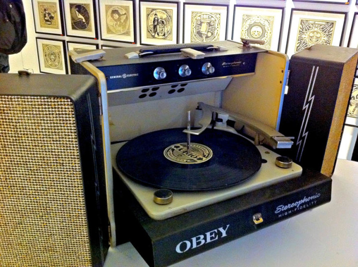
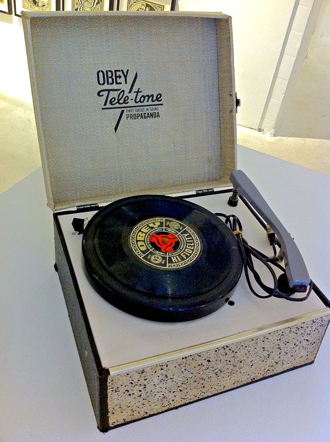
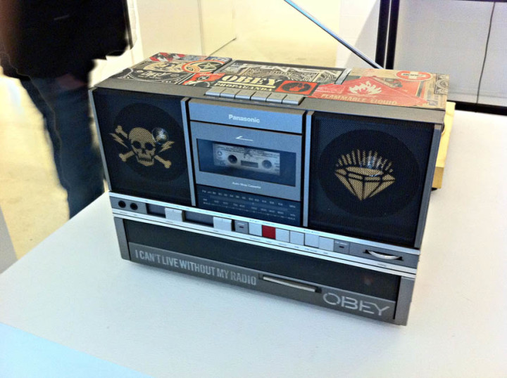
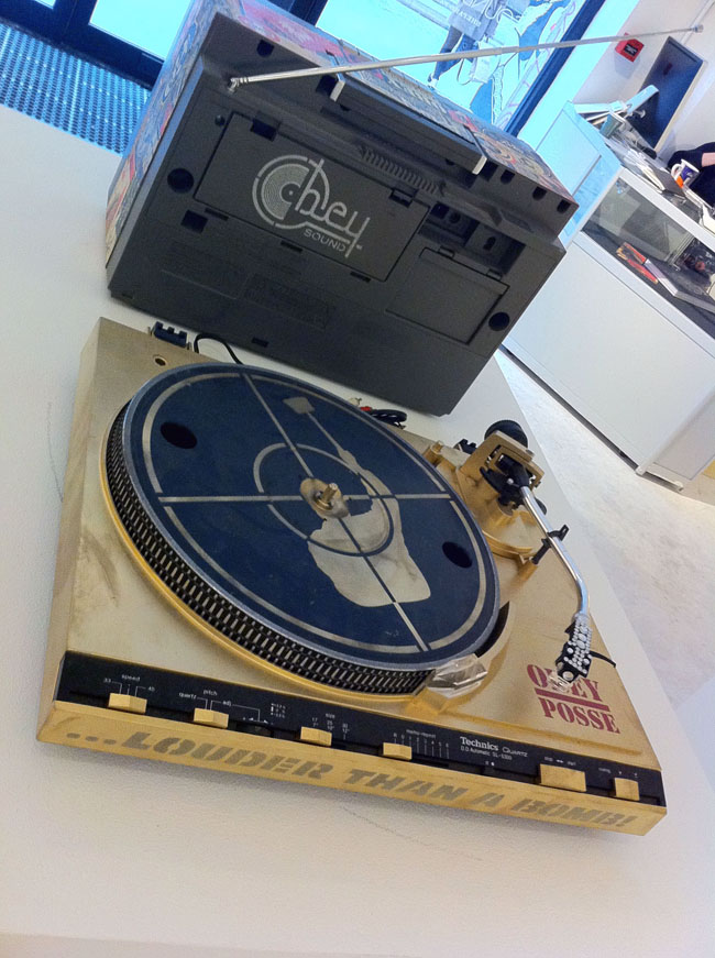
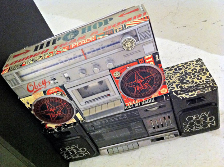
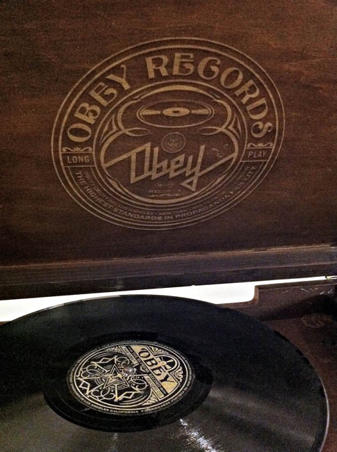
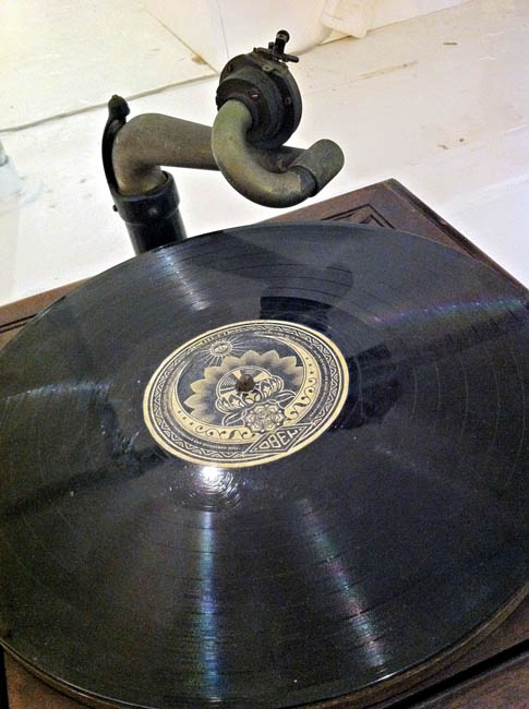
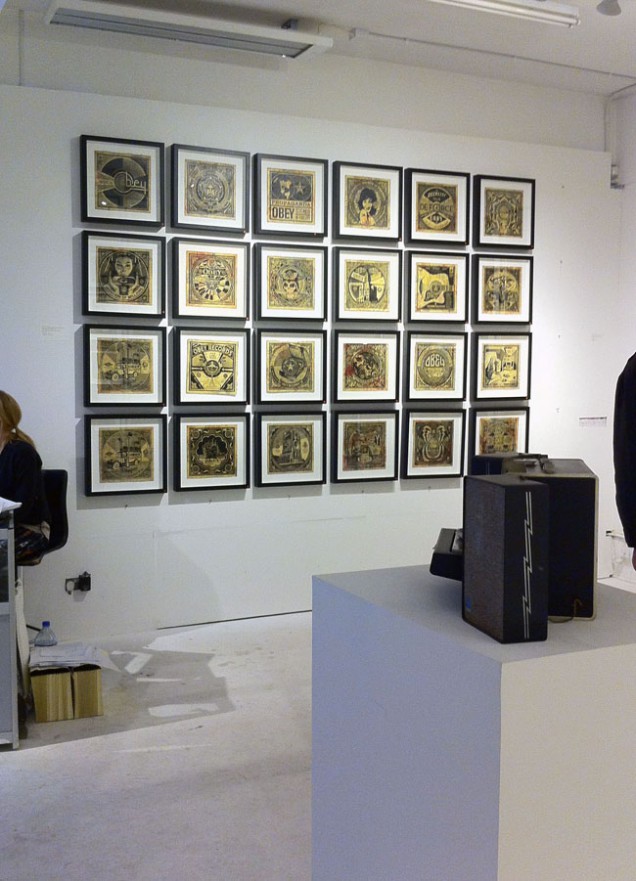
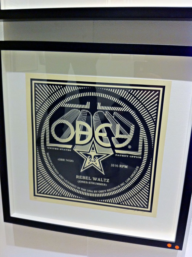
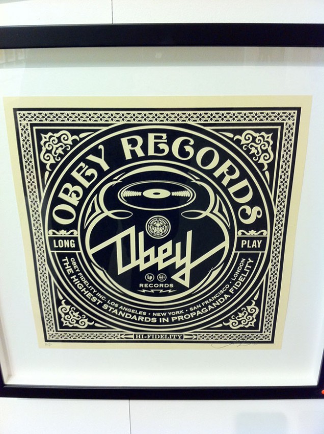
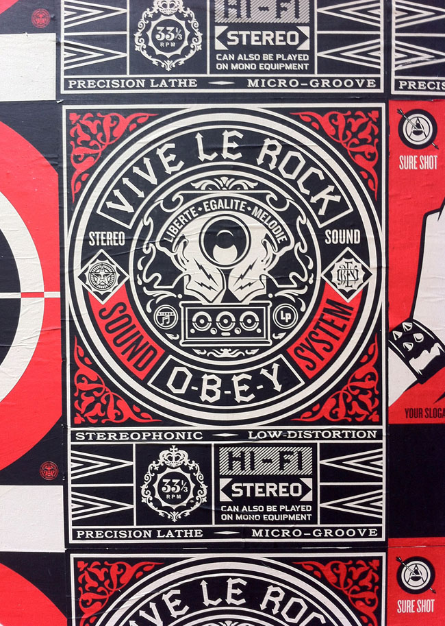
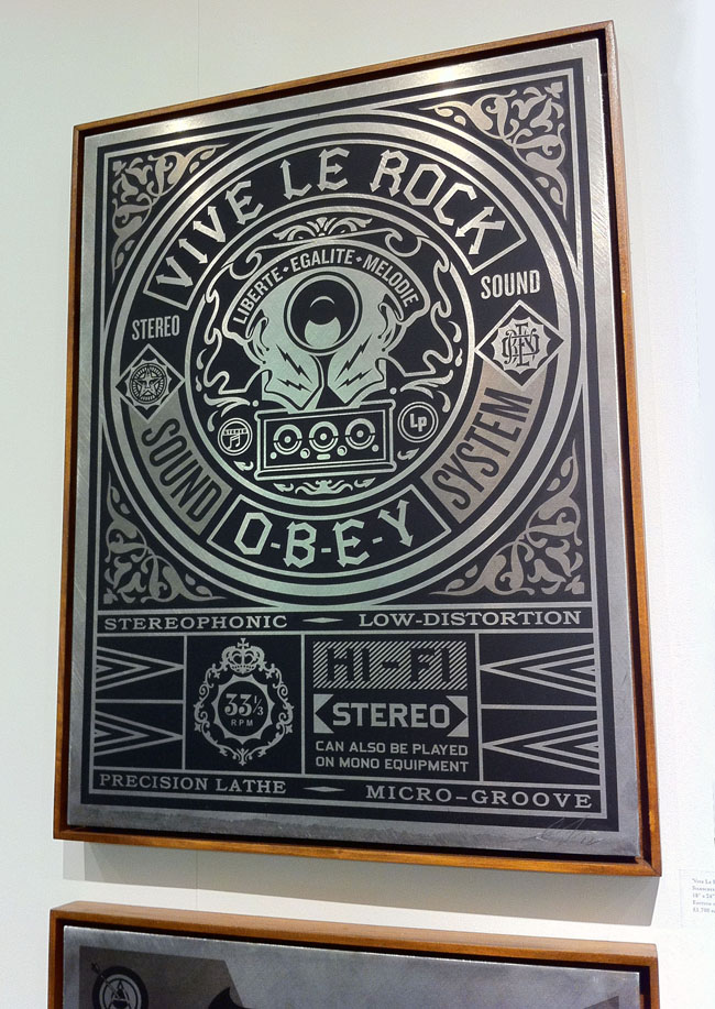
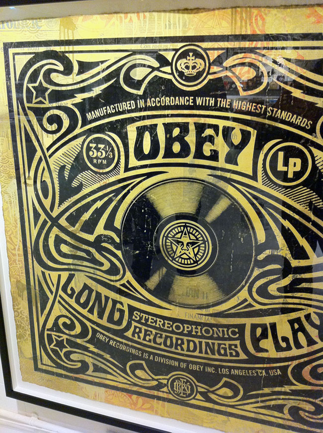
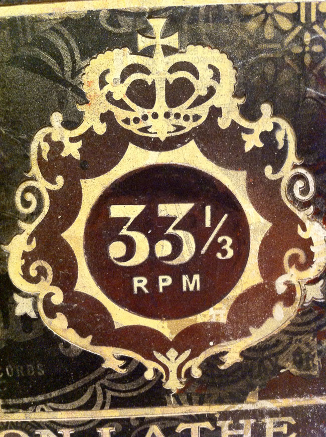
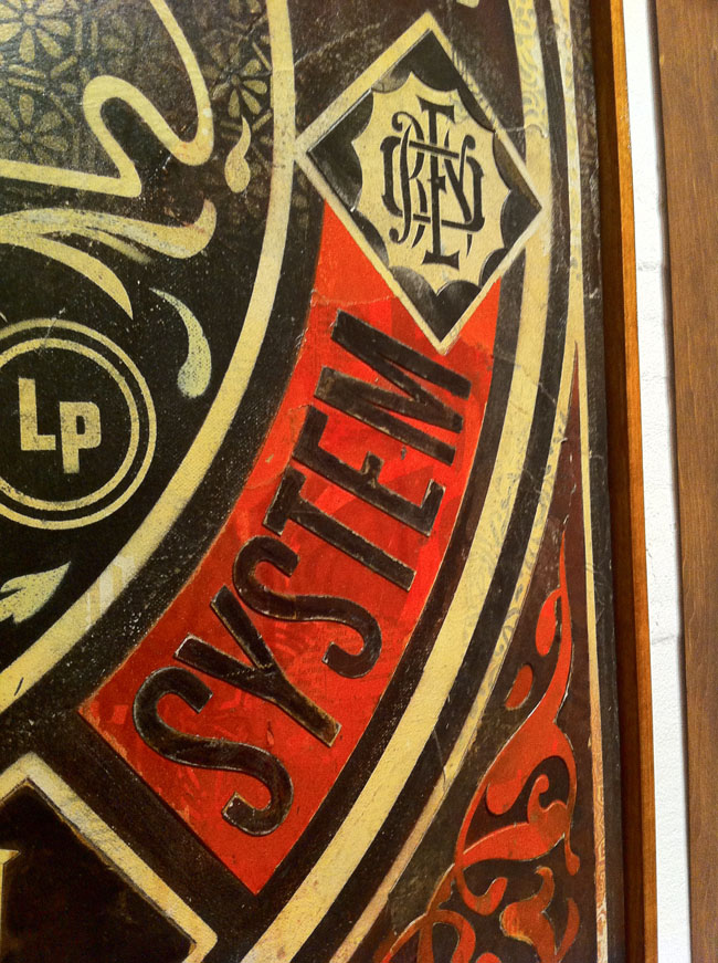
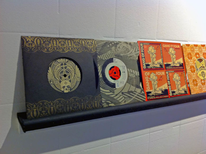
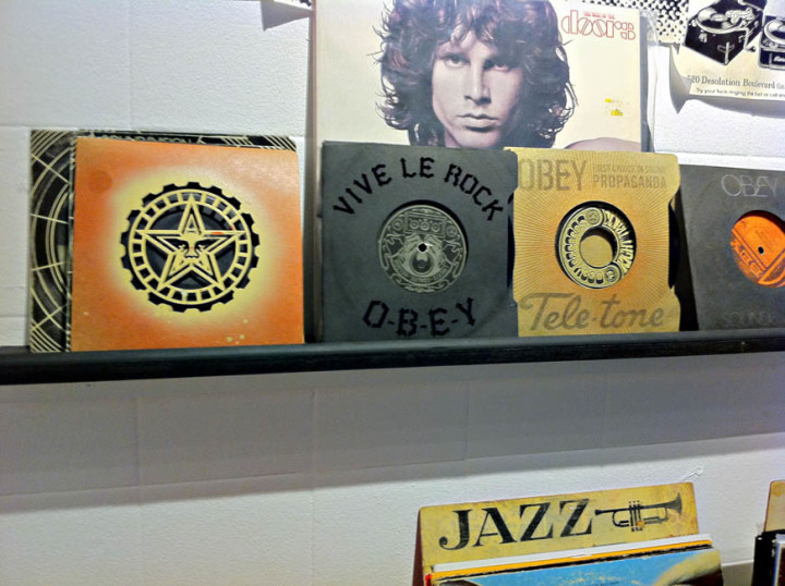
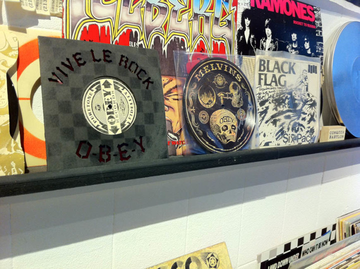
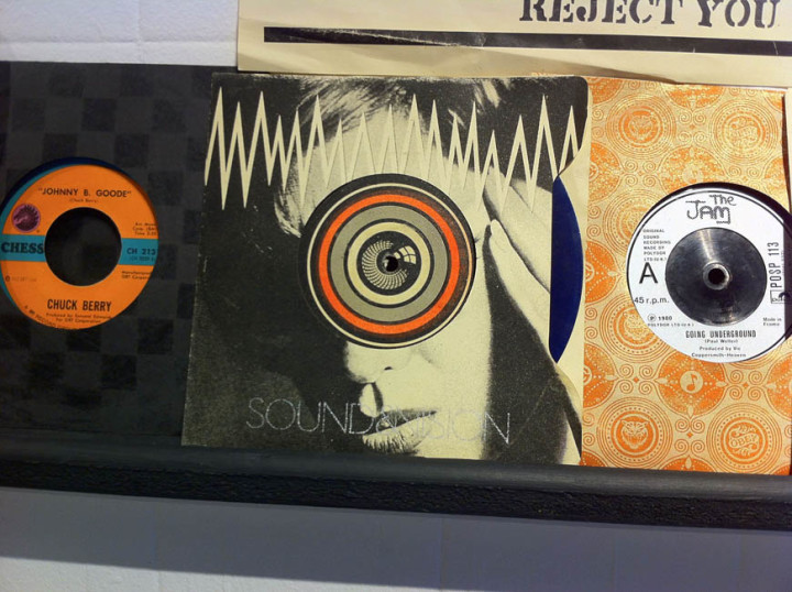
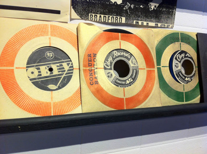
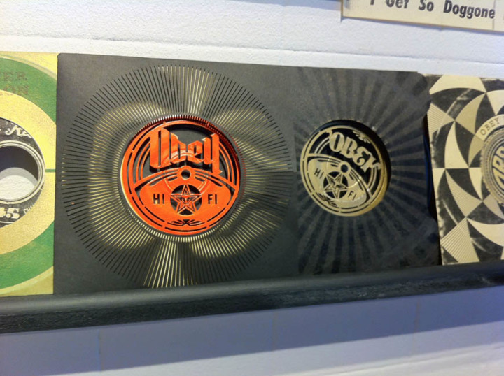
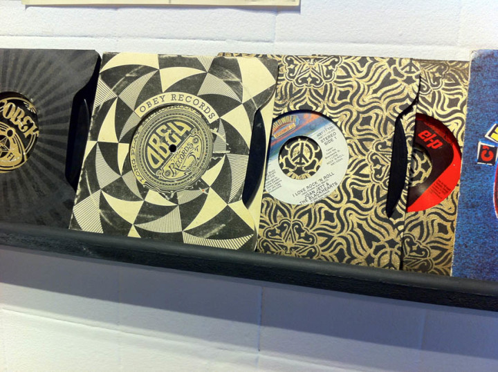
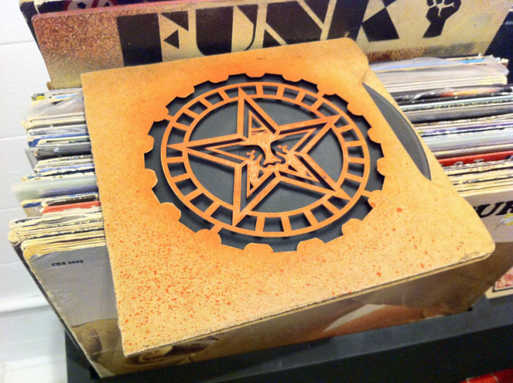
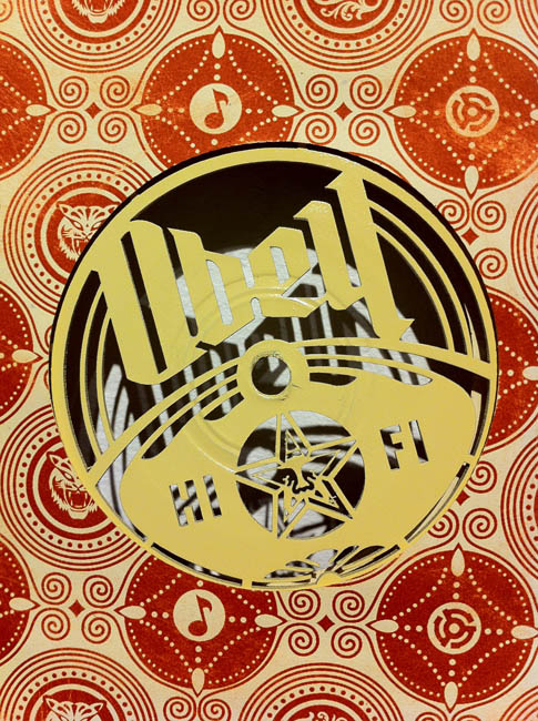
The part of the show that I thought most successful was the gallery with the records in racks, (part of Fairey’s own collection), customised turntables and 12″x12″ prints. Copies of sleeves he’d designed were randomly inserted throughout the vinyl as well as a tantalising selection of 7″ custom ‘Obey Recordings’ laser-cut sleeves and record labels. These were beautiful objects and the fact that you could touch them just added to the experience, sadly they weren’t for sale and I wanted to steal one so badly but resisted. Various vintage record and tape players were dotted about with stencils and stickers added to personalise them in the Obey way, you could even play the records on some of the turntables which was a nice touch. A lot of the prints in this gallery were fictional Obey record sleeves using advertising logos and jargon from the classic Stereo Test record era mixed with Fairey’s usual propaganda-type slogans. There was repetition of the imagery but each design held it’s own and it was hard to pick a favourite as they were all beautiful. Above the record racks sat a wall of black & white gig posters, except they weren’t. Fairey had taken existing images and posters and retooled them with his own logos and messages and this is where I start to have issues with some of the work.
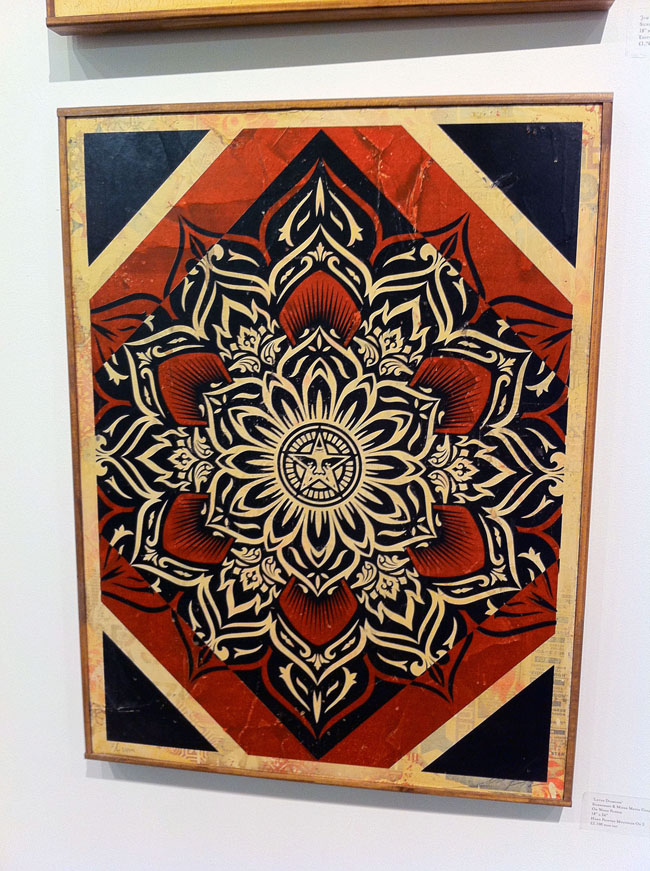
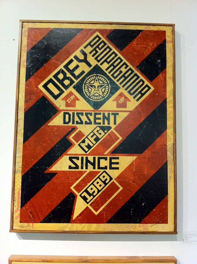
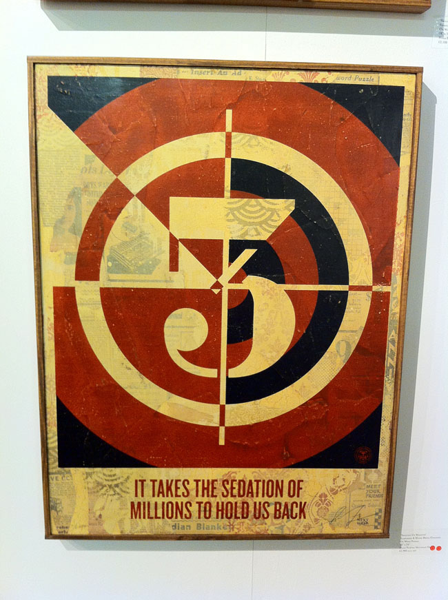
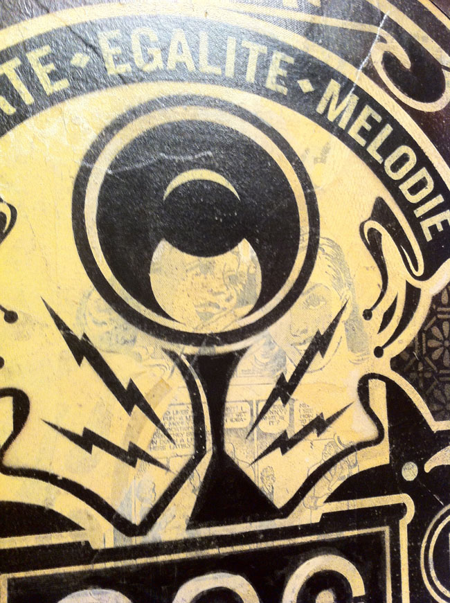
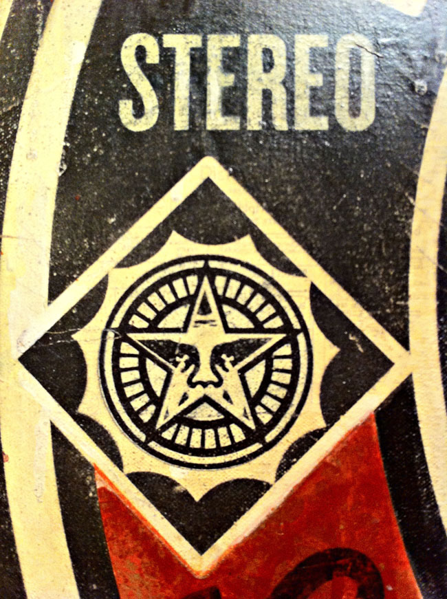
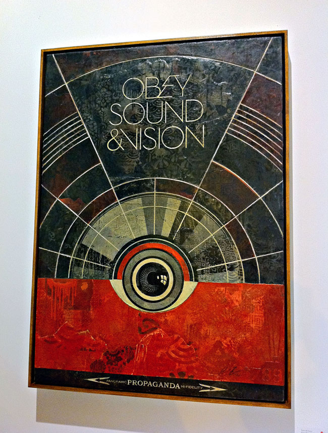
Before everyone pulls me up and says, “Shepard Fairey using other people’s work? surely not!? Next you’ll be telling me bears shit in the woods?” I’m pretty well versed in his history. He’s always appropriated the imagery of others, subverted existing logos and messages to his own needs, he’s by no means the first or the last to do this and various lawsuits have been filed as with any successful artist – ‘where there’s a hit there’s a writ’. The whole argument for and against appropriation could fill books and I’m not about to go into it at length here, also given that I use others materials in my own work there’s an element of the pot calling the kettle black. However I have my own yardstick for how much of something is used, abused or hinted at in any work and far too often he goes over the line with parts of his designs here. I find this work to be the weakest and it cheapens the rest of it somewhat as it’s a quick and easy thing to take an existing image or logo and reinterpret it – it’s lazy for the most part, a quick artistic crowd-pleaser.
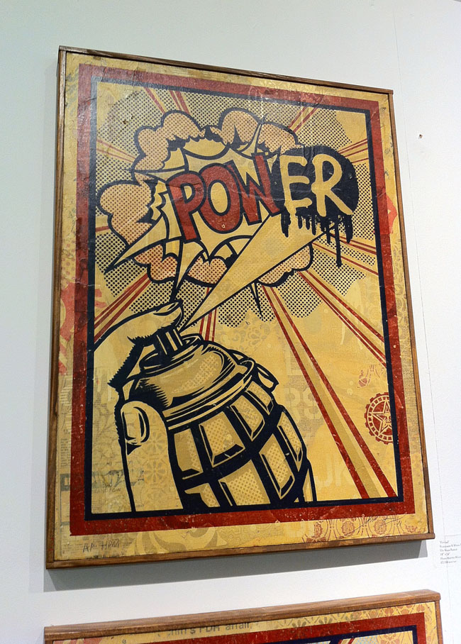
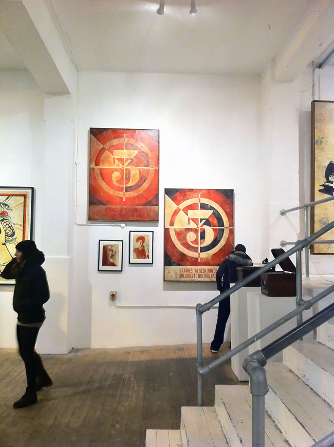
I find it more interesting to take the benign and turn it into something beautiful by re-contextualising it like Warhol‘s Campbell’s Soup tins or Lichtenstein‘s comic art appropriations (although this still doesn’t discount the matter of copyright infringement). Fairey does this well with the various nods to the design language of 60’s and 70’s era record graphics: turntable speeds, 45 adapter shapes, retro fonts and patterns – you’ve seen it, or something like it, before but it’s not a complete rip. But by taking existing gig posters and redesigning them into more gig posters in his own image he’s not bringing anything new to the medium, just basking in the reflected glory of others’ work. Chuck D‘s Public Enemy logo is modified so that the silhouetted figure in the crosshairs now has a pasting brush, Lichtenstein’s pop art is parodied with a grenade as spray can adding an ‘er‘ to a ‘POW!’ speech balloon, Jamie Reid‘s ‘No Future’ Sex Pistols tour poster is modified and Joe Petagno‘s Motorhead logo is just used straight in a couple of pieces. Another one takes Jasper Johns‘ multi-layered number paintings as inspiration and just changes the typeface, again using the collaged bed for texture that worked far more successfully on the previously mentioned pieces where he’d used his own designs.
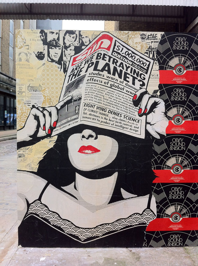
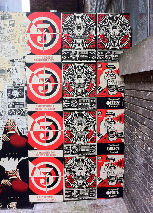
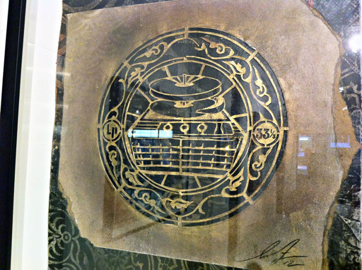
By parodying other artists’ work I feel Fairey is cheapening his own art, I think he’s better than this, well, I know he is because of all the other work in the show. It is littered with cultural bookmarks and (mostly Rock) icons – Joey Ramone, Lennon & Yoko, Lemmy, Iggy, Cash, etc. – again taken from existing (uncredited) photographs and homogenised in the clean, smoothed out style he made famous with his Obama ‘Hope’ poster. 80’s graffiti heroes like Haring and Basquiat feature alongside enough punk and post punk legends to fill an issue of Mojo. And that’s fine but I’m not sure what he’s trying to say by including these aside from the inherited ‘cool’ factor and the rebel nature of a lot of the subjects, linking into the subversive attitude and message in many of the other pieces no doubt. Grenades feature in several pieces and the grenade as spray can image from the ‘PowER’ piece is an extremely strong icon which he should revisit and exploit in future works rather than have relegated to a Lichtenstein pastiche.
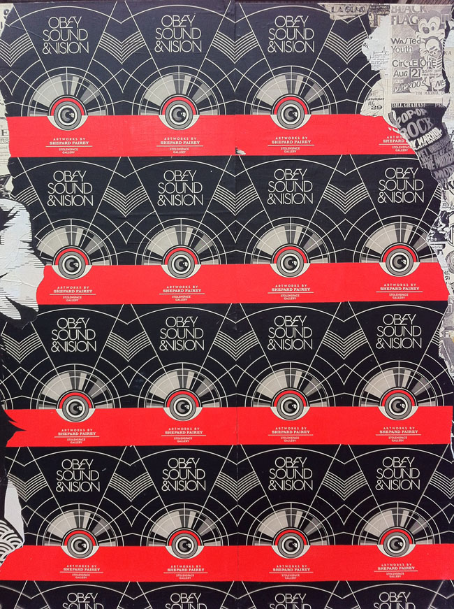
I found the upstairs of the main Stolen Space gallery the most uneven of all the work including a few larger pieces that looked like they were experiments in a new direction but with little visual direction apparent. Interestingly, whilst virtually every piece had sold throughout the exhibition, these had not, possibly more due to their high price tag than the virtual absence of anything that said ‘Obey’ about them. It was this elevated section that seemed to have the left overs in it, odd sized pieces which didn’t fit elsewhere so had been clustered together when a few less and a bit more surrounding space would have given them more impact and taken any filler out. The best here were the retired stencils – one of his classic Andre The Giant with painting instructions – and the design for the show poster itself which greeted you when you walked in. Overall though there was way more good than bad and to have such high quality throughout with that number of pieces – there must have been around 200 or more – is some feat.
The show ends on Nov 4th so you have less than a week to check it out and we feature Z-Trip‘s soundtrack mix for the exhibition on this weeks Solid Steel.

Good post, Kev!
(do I get a no-prize for the shortest comment?)
I might have read some of it wrong, it might be my projections, but whenever I hear or see Shepard these days, he seems to be conflicted with these issues. Maybe its less about not being street anymore than maybe not understanding why certain people now turn against him. I think I could best argue my point mentioning those videos he released from Copenhagen, where he had painted a wall at a location where a squat had been evicted and torn down. Then some vandals kept destroying his work and shepard seemed genuinely distraught about this as if he just could not understand why. some of his arguments were strange. he did agree to paint a wall in that location with its history, so it can’t be that hard to understand that this will piss some people off. it got me thinking about this issue of what happens when people switch over from an underground, illegal art scene to pretty much the main stream, which frankly, he has. I personally have no problem with it, but artists who do it need to accept a few consequences, first that they made a choice, second that some former friends are gonna turn away from or even hate you, and third the subversive aspect of your art might feel commodified. Yes, you can now make intelligent pop and affect different people in more ways. And make tons of money while doing it. So enjoy these aspects of it and do good things with the moniez. Where I do have a problem is with some of the choices in his imagery, some of it you mention above. All the iconic revolutionary or rebellious imagery, that’s the part that bothers me. the commodification of it. but hey, i am old school.
yes, that’s the track, and thanks so much for not covering up the labels. idea, have you ever done a dj set and tweeted the tracks you are playing at the moment? would anyone else than me find that fun?
I agree with you on the business/brand level – anyone who has a fully formed clothing line and a team of people running their site, workshop and filming public painting events on a cherry picker is big time. I don’t necessarily agree that he’s sucking up to a scene to be cool though, he’s presenting new work and when he comes to town he paints and stickers other parts of it too. I’m not sure how illegal most of it was but I don’t have a problem with any art of the street being either / or as long as it’s good. My main grumble with the shop was that there was little product that reflected the content of the show on sale, there’s a book to be made out of the work contained in it for sure but maybe there wasn’t time to put one together, there didn’t seem to be any catalogue for it anyway.
Notions of ‘cool’ are entirely subjective aren’t they, some people probably thought he was uncool the minute he sold a canvas or print rather than stuck to fly posting. Most of the choices of icons he portrayed in his pieces are deemed cool by the establishment but seem antiquated and obvious to me (no electronic artists? not even Kraftwerk? – although he did have Kraftwerk records in his collection I saw).
The record thing, I didn’t really even look through to see what he had TBH, it didn’t matter to me, it served a purpose to create the scene of a record store, fitted the mood of the event and it was personal. Quite a bold move really, I wouldn’t display my records to the public, I wouldn’t see some of them again. Better than getting a load of charity shop finds to pad out the gallery to create the illusion and his own designed vinyl objects fitted in nicely.
I didn’t get the message that he was trying to still be ‘street’ (not with pieces at those prices anyway) when I looked at it but messages in some of the art do conflict with the reality that they are shown in – not the record-based designs so much but some of the ones in the main gallery which preach an anti-government / passive state message. These sit a little uneasily with the gallery surrounding and price tags but I’m in two minds whether that matters. I’ve always seen Shep’s work as propaganda poster art from a parallel universe except when it crosses over into real life (Obama being the most obvious example) and it comes down to whether the work is good or bad to me. Yes I do enjoy seeing it in public, huge on a brick wall, stickered or stencilled high up on a post or whatnot but I think his work also works just as well in a frame at home or in a book.
Banksy’s however I find loses part of its appeal when relegated to a book or print – not the message so much but because a lot of his stuff works really well with the location it’s painted in. Take that away and you lose something, it’s nice to be walking along the Southbank and turn a corner to see a rat listening through headphones or to see a message stencilled half way up a flight of stairs. I’m not sure what the Copenhagen story you refer to is though?
The track on Saturday was probably Lone – Crystal Cavens 1991 on R&S – kind of retro techno thing?
Thanks for this review, you find the right tone of criticism here, pointing out the good aspects and some fair problematic points. I was actually much more critical of the show, when I went to see it last week. My main impression of this whole shepard fairey hits london deal, incl. pop up obey shop and z-trip hip hop mix and postering the courtyard, was of him trying to kiss up to a certain scene, him trying to say, look, I am still cool. in my opinion shepard is now just as much a business/brand/artist as are banksy and a few others, but he remains a bit more conflicted about it. the worst part for me was his record collection being shown. fine, you listen to cool music, but so does paul ryan (rage against the machine). it means nothing at this point. I think shepard should start a process to accept that he made it as an artist, and naturally some people will say that he sold out, but he should move beyond that. he should accept he is a pop artist now, who came up through street art, find peace with that, do intelligent pop, but stop to try soooo hard to still be viewed as cool. the sad story was the one copenhagen, he should learn from that though.
on a different note, I am trying to rake my brain what the 2nd or 3rd track was you played at the forum on friday night, i know it, just can’t place it. a sort of warp sounding electro beat track. very nice dj set! if bloody belleruche just didn’t play on and on before …